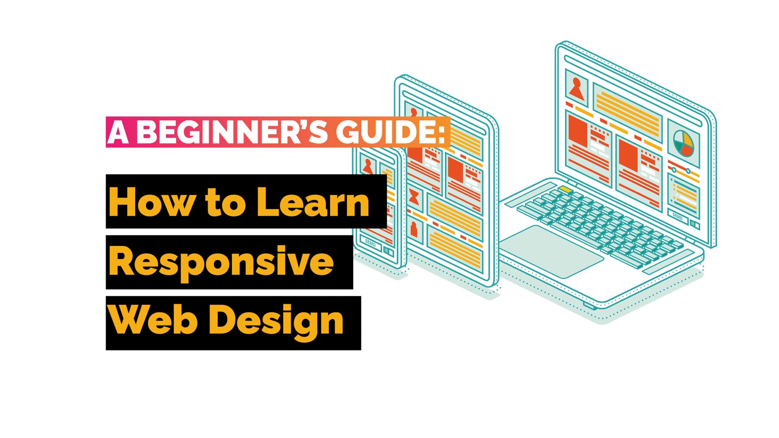
That’s where responsive web design comes into the picture. Think of responsive design as a background system that adjusts website windows and formats to ensure they look stunning and fit for purpose regardless of the device your website is being viewed on.
But how do you learn it? Don’t worry: it doesn’t have to be as complicated as it sounds.
Table of Contents
Choosing the Right Tools
Building responsive websites requires using the right tools. You’ll need:
- CSS and HTML: CSS (Cascading Style Sheets) and HTML (HyperText Markup Language) are the foundational technologies for web development. HTML provides the structure of the webpage by defining elements like headings, paragraphs, images, and links. CSS is used to style these elements, controlling aspects like colour, font, spacing, and layout.
HTML elements are styled and positioned using CSS. For instance, an HTML ‘<div>’ can be styled with CSS to have a specific width, margin, and background color. CSS makes it possible to create visually appealing and responsive designs by applying styles to HTML elements. - Media Queries: Media queries are a feature of CSS3 that allow you to apply different styles depending on the characteristics of the user’s device, such as its screen width, height, orientation, resolution, and more. They are crucial for responsive design as they help tailor the layout and appearance of a website to different devices.
Media queries work within CSS to conditionally apply styles based on device properties. For example, you can use media queries to change the font size for screens narrower than 600px, ensuring readability on mobile devices. This is done by embedding media queries directly in the CSS that styles HTML elements.
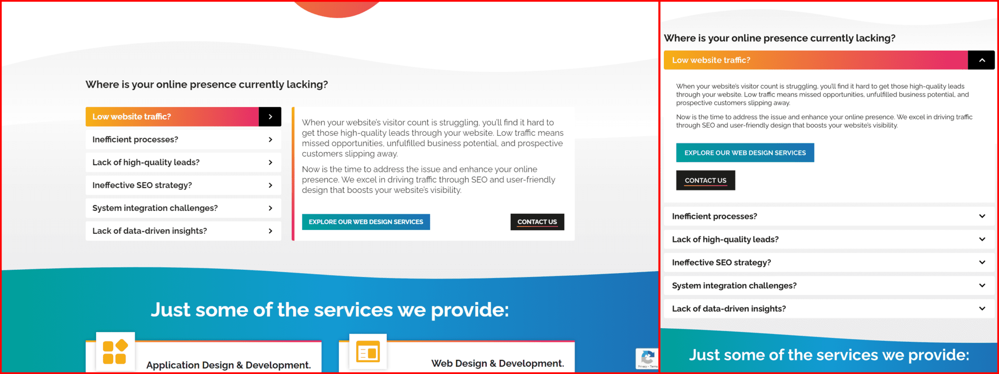
- Flexbox Layout: The Flexbox Layout module provides a more efficient way to lay out, align, and distribute space among items in a container, even when their size is unknown and/or dynamic. The flex container expands items to fill available space or shrinks them to prevent overflow.
Flexbox is a CSS layout mode that helps arrange HTML elements in a flexible and efficient manner. It simplifies the process of creating complex layouts with fewer lines of code compared to traditional methods like float or positioning. Media queries can be used alongside Flexbox to adjust the layout for different screen sizes.
Depending on the way something is built, flexboxes are usually part and parcel of well equipped page builders, if they aren’t it can be a very complicated area when it comes to design for those that aren’t accustomed to website design. - Fluid Layouts: Fluid layouts use relative units like percentages instead of fixed units like pixels to define the size of elements. This approach ensures that the layout adjusts smoothly as the screen size changes, maintaining proportionality and usability.
Fluid layouts are implemented using CSS, where properties like width, margin, and padding are set in percentages. This ensures that HTML elements scale relative to their parent container or the viewport. Media queries can further refine these adjustments, providing specific styles for different ranges of screen sizes. - Responsive Images: Responsive images are designed to provide the best visual experience across a range of devices. Techniques like ‘srcset’ and ‘sizes’ attributes in HTML, and CSS properties like ‘max-width’, ensure that images scale appropriately depending on the user’s screen size and resolution.
HTML is used to define the image elements, while CSS is used to control their presentation. For example, an image can be set to have a max-width of 100% in CSS, ensuring it never exceeds the width of its container. The srcset attribute in HTML can provide different image sources for different device resolutions. Media queries can also be used to apply specific styles or select different images based on the device’s characteristics.
Interrelations of the Tools at a Glance
- HTML provides the structure of the webpage, defining elements like divs, headers, paragraphs, and images.
- CSS styles these elements and manages the layout, ensuring the design is visually appealing and functional.
- Media queries in CSS allow for different styles based on device properties, making the design responsive.
- Flexbox and Fluid Layouts are CSS techniques that enhance layout flexibility and adaptability, working seamlessly with media queries to adjust the design for various screen sizes.
- Responsive Images ensure that visuals look good on all devices, utilizing both HTML and CSS to achieve the best performance and appearance.
Using Relative Sizing in Responsive Design
Utilising CSS Grid for Flexibility
Once you have the tools, you’ll need to use percentages or a CSS grid layout to determine element size. This approach ensures that your website adapts seamlessly to different screen sizes and resolutions. Here are the key components you’ll need to define in relative terms (and for clarity, probably in this order to):
Banner or Header
The banner or header is usually the top section of your webpage, containing your logo, site title, or navigation links. Using relative units like percentages for width and height can help maintain its proportion across various devices.
Navigation Bar
The navigation bar guides users through your website. It’s essential to make it flexible, so it remains usable on devices ranging from large desktop monitors to small smartphones.
Main Page Content
This is where your primary content resides. Using a fluid or grid layout helps this section adjust its width based on the viewport size, ensuring readability and aesthetic appeal.
Sidebar (if using one)
Sidebars are often used for additional navigation, links, or advertisements. Defining them in relative terms ensures they don’t overpower your main content on smaller screens.
Footer
The footer contains important information and links, typically at the bottom of your page. Using relative units ensures it stays at the bottom and scales with the rest of your content.
By understanding these components and their relative sizing, you’re on your way to mastering responsive web design. For detailed guidance and expert tips on implementing these techniques, we encourage you to research further or reach out to us directly.
Implementing Media Queries
Media Queries, as discussed, is a scheme that lets elements on your pages respond to screen resolutions. It uses CSS3 and works based on simply conditional “if-then” commands. To use it, you will require some coding knowledge, and for the most part, answers can be found after a quick googling or two, but please remember, there is always going to be a learning curve when it comes to implementing coding.
Here’s an example of what a straight-forward block of CSS code might look like for this purpose:
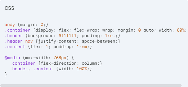
To create a responsive web design, you will need to specify the container, header, and other elements while defining the flex-direction. The provided CSS code demonstrates how to use Flexbox and media queries to achieve this. Let’s take a look at the above screenshot in its fully formed glory (and universally accepted formatting) :
     body {
    margin: 0;
}
.container {
    display: flex;
    flex-wrap: wrap;
    margin: 0 auto;
    width: 80%;
}
.header {
    background: #f1f1f1;
    padding: 1rem;
}
.header nav {
    justify-content: space-between;
}
.content {
    flex: 1;
    padding: 1rem;
}

@media (max-width: 768px) {
    .container {
        flex-direction: column;
    }
    .header, .content {
        width: 100%;
    }
}
In this example, the ‘container’ class uses Flexbox for layout with ‘display: flex’ and ‘flex-wrap: wrap’ to ensure elements wrap as needed. The ‘header’ is styled with a background colour and padding for spacing. Within the header, the ‘nav’ element uses ‘justify-content: space-between’ to space out its children elements. The ‘content’ class is set to flex-grow ‘(flex: 1)’ and has padding for internal spacing.
The media query ‘@media (max-width: 768px)’ adjusts the layout for smaller screens. When the viewport width is 768px or less, the ‘container’ changes its ‘flex-direction’ to ‘column’, stacking the elements vertically. Additionally, the ‘header’ and content elements are set to ‘width: 100%’ to ensure they span the full width of the container.
By specifying these properties, you can experiment with different parameters to achieve the desired responsive layout. Adjusting values like padding, flex properties, and media query breakpoints will help you fine-tune the design until you’re satisfied with the outcome.
Testing Responsiveness on Different Devices
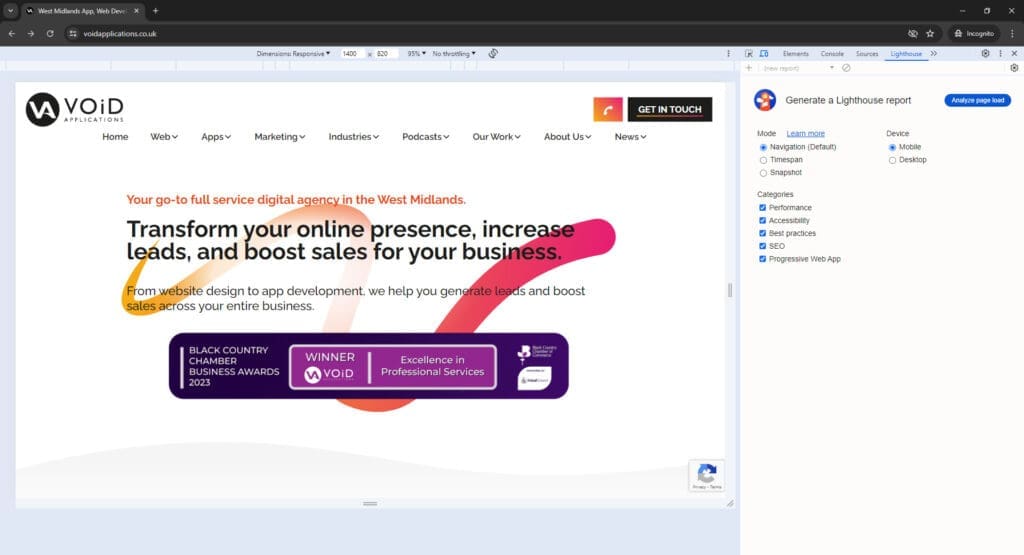
Once you implement the tools and techniques described above, it’s crucial to test the responsiveness of your website to ensure your coding efforts are successful. Google’s Lighthouse tool is now the preferred method for testing mobile-friendliness. Lighthouse is integrated into Chrome DevTools and can analyze your website’s performance across various devices. To use Lighthouse:- 1. Open Google Chrome and navigate to your website.
- 2. Open Chrome DevTools by right-clicking on the page and selecting “Inspect,” or by pressing Ctrl+Shift+I (Windows/Linux) or Cmd+Option+I (Mac).
- 3. Navigate to the Lighthouse Tab within DevTools.
- 4. Generate a Report by selecting the options relevant to your test (e.g., Mobile) and clicking “Generate report.”
Building a Mobile-First Approach
A mobile-first approach in web design focuses on creating the best possible experience for mobile users, recognising that they represent a significant portion of web traffic. This strategy involves designing for smaller screens first and then progressively enhancing the design for larger screens. By prioritising mobile design, you ensure that your site is efficient, user-friendly, and optimised for the most commonly used devices.
Given that mobile web traffic now comprises around 60% of all internet traffic, addressing the needs of mobile users is crucial. A mobile-first approach helps in delivering faster loading times, better navigation, and an overall enhanced user experience, which can positively impact your site’s SEO rankings and user engagement.


