Table of Contents
1.
Hierarchically Structured Headings and Elements.
Pages should be well structured and broken up into sections using proper headings. Text size and font can be used to differentiate body text and heading text. Both should be easily readable.
With HTML these headings are set out using H1, H2, H3 and H4 headings, but we’ll go over things here in terms of the visual aim instead.
You can have heading hierarchies, as well as organising your body text in the same way, as an example:
Here’s a heading for the section of the page (a H1 that is set to 24pt).
Here’s a second heading, that would be used after the H1 but never before (a H2 that is set to 20pt).
Here’s the beginning of the body text, setting out the context (an excerpt or introduction may be this size set to 16pt).
And here’s the main body text at 12pt, the size that all the general body text might be on your app or web page.
You can add sections of text within the body that are larger to draw attention to them, but if they conflict with sizing or weight of the headings, you might need to double check that you aren’t sacrificing clarity. You can compromise on size, change the font style or colour to differentiate it from other headings so the hierarchy isn’t compromised.
Different elements on the page should also use hierarchies. Say a popup appears on the screen that requires an action. You can give the popup a title, describe what the action requires, and add buttons. All of these need to be distinguishable from each other. Using size and style is a great basis before adding colour.
In this example, text size and weight has been used to highlight each section, look at how despite the lack of colour everything is clearly broken up on the right, compared with on the left:
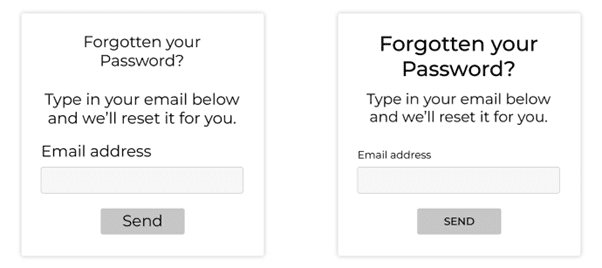
We can improve on this too, using high contrast colours, making sure to repeat certain elements like buttons, and carefully naming links and buttons.
2.
Links and Buttons.
Links can be found within body text, menus and buttons. We should be clear about what all of these links do and where they lead.
Someone quickly scanning through your page for a link shouldn’t have to read through all of: “If you want to contact us and book in an appointment for a zoom meeting, go here” if they want to contact you. “Go here” just isn’t descriptive enough. It’s even more useless for someone using a screen reader- if all of the links and buttons just say “click me”, “link” and “go” like an Alice in Wonderland potion, how can they know where they’ll end up?
Instead, we can phrase things a little better. “If you want to book in an appointment for a zoom meeting, contact us.”
We can use the same logic for buttons too. Phrasings like “learn more”, “keep reading” are more useful. We can use this logic to improve the button in the previous example too, instead of “send” it can read “reset password”. Much better.

3.
Adding Colour.
In most cases your website or app will feature colour, they might be dictated by your branding or preference, but either way we should use them to help usability and clarity.
While colour hue (red, green, blue etc) seems like an important factor in creating contrasts and making things “pop”, far more important than this is value, or brightness. Simply, if your website doesn’t work in grayscale, it probably doesn’t work at all. Designing with colour values in mind has some benefits: it allows for greater contrasts (essential for accessibility and readability) and it helps distinguish things for people with colour blindness.
Colours can become quite complex. When using a box colour picker for example- each colour hue will have it’s own inherent brightness depending on it’s saturation. A fully saturated yellow at maximum brightness will have a higher value than a fully saturated blue at maximum brightness (example shown below). This is useful to know- while it’s not possible to distinguish the hues for one of the most common forms of colour blindness; red-green colour blindness (protanopia and deuteranopia colour vision deficiency) we can distinguish the values from each other from a functional standpoint. We do this with the brightness value. It helps everyone too, brightness value is far more important than colour hue. For an example of how colour CVD can affect vision this site has a great simulation: https://davidmathlogic.com/colorblind/#%23D81B1B-%23177D00-%23FFC107-%23004D40
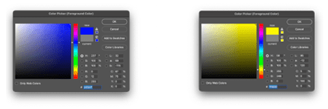
Have a look at these examples, we can change the value so that there is contrast, without changing the hue at all. The issue of value becomes clear when the image is converted to grayscale.

4.
No Flashing.
This might be the most important on this list. Your website not being navigable is one thing, it being dangerous is another.
Nothing in the design of a page should contain anything that could cause seizures or physical reactions. The WCAG guidelines say that web pages should not have elements that flash more than three times in a second. They also recommend that any motion graphics can be disabled unless they’re important to the information being conveyed or the functionality of the website.
We’d recommend no flashing at all. It’s unpleasant to look at and it’s much safer to mitigate the risk altogether.
5.
Form Fields.
Form fields can be hard enough after a long day, even more so if you need to use assistive technology to fill them out and they aren’t well designed. But it’s an easy fix.
It’s always better where possible to keep permanent form field titles. Avoid putting form field titles in the boxes so that they disappear when they start to type- it can be difficult to know what you were supposed to type into the box once the prompt is gone. They should be designed as clearly as possible as well, it might look sleek on the page to have the input boxes minimal or hidden until someone starts entering text, but be sure you aren’t sacrificing accessibility or clarity.
Error messages should also be clear and explain exactly what needs to be done. A little red warning triangle might look tidier, but it helps nobody if the user doesn’t know precisely what they’re doing wrong.
Have a look at the examples below; one is clearly more intuitive to use than the other.

An added benefit of using alt text is that it can be a useful tool in search engine optimisation and search engine ranking. So it’s good for your users, and good for you too.
6.
Alt Text for Images
Images can be an important tool for providing variety or context to a page. However, for people who can’t see those images- they can present a gap in the information instead. Adding alt text can fix this.
Alt text can be added for images that aren’t purely a decorative graphic or abstraction, this cuts out unnecessary information being read out through screen readers or dictation software. It’s also important to be mindful of how the alt text is written. Describe the image as concisely as possible- nobody using a screen reader wants to sit through a paragraph of information describing a simple image. If the body text or descriptive text on an image already describes what is in the image, you can simplify things further to avoid doubling up on information.
An added benefit of using alt text is that it can be a useful tool in search engine optimisation and search engine ranking. So it’s good for your users, and good for you too.
7.
Using Clear, Simple Language
Depending on the context, opt to use the shortest and simplest words possible on your pages. It’ll be quicker to read through and far more accessible. While it might not be an issue for you to read through heavy literature, it’s better to write at a level that “does not require reading ability more advanced than the lower secondary education level” according to WCAG guidelines.
At the same time, we can avoid walls of text which may be off-putting to some readers. Using the formula laid out earlier with structured headers in combination with avoiding dense paragraphs, you’ll be that much more dyslexia and ADHD friendly.
Sometimes the nature of your business means that it’s simpler to abbreviate things, we do it at the VOiD HQ all the time and it can become second nature to call something by its abbreviated form to the point you forget what the expanded form even is. It’s good practice to always at least use the expanded form the first time it’s mentioned on a page (or section depending on how large the page is) – it’s best not to assume everyone knows what all of the abbreviations and jargon mean. If this is something you’ve found you do, or even need to do, then circumvent any misconceptions by offering a FAQ or Glossary that can be linked and referred to.
Bear in mind that some people will have less range of motion or be using different input devices that might not work with a more complicated user interface.
8.
Simple UI Elements and Navigation.
Use tried and tested elements in your user interface, the more familiar something looks, the more likely that a user will know how to interact with it intuitively. It might result in a nice cutting-edge design to reinvent the wheel for your website or app, but it’ll frustrate your users if they can’t get their heads around how to use it.
Adding simple shapes like a triangle as a play button, a dropdown arrow for a menu list or a magnifying glass in your search box can go a long way in showing exactly how an element should be used.
Navigating through the site should also be simple, having to click to hold and drag things to navigate your site or app might not be practical. Bear in mind that some people will have less range of motion or be using different input devices that might not work with a more complicated user interface.
9.
Repeating Elements.
This is a great design practice anyway. Making sure that the buttons at the top of the page and the ones at the bottom are the same will make things far more predictable and easier to use.
We can see this in a whole number of different ways every day, even your microwave and TV remote might have groupings of similarly shaped types of button that shows you that they do similar tasks to each other compared with other button types.
People know what they’re looking for when they’ve seen something a few times already as they scan down the page, they’ll be able to pick out something that’s relevant to them. It’s not just buttons either. If you have a contact form on your website, it’s better to have all of the contact forms on your site look the same, unless they actually do something else. Otherwise, it can get confusing.
10.
Focus Indicators.
Focus indicators are a helpful way to show where you are on a page and what’s happening. This is especially true if you don’t use a mouse or trackpad to navigate, there may not be a cursor at all.
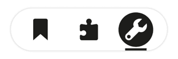
Focus indicators highlight an element that has been hovered over or selected. That way as you tab key around a page you always know where you are. Below is an example of a well-designed focus state indicator. The selected icon has reversed colours, is circled, and has an indicator bar below too.
Final Thoughts.
That’s a lot of points to consider, and there are many more but implementing them shouldn’t be a problem for a credible or professional developer. Designing a website or app with accessibility in mind means that all of your users will get the most out of the product or service you offer. They get to use a site that’s easier to navigate, you get a wider user base (and in some cases better SEO too). Plus, accessible designs just look better.
If you’re looking to build your next project or think one of your current ones could do with some inclusive, accessibility-friendly changes, you can contact us and discuss what you need.


